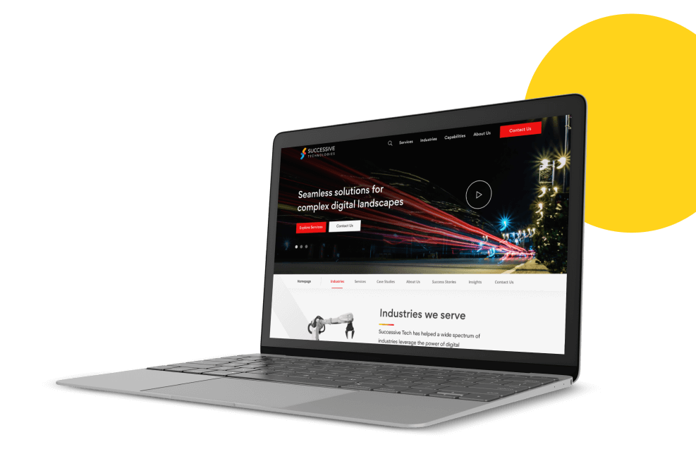
Framework
Project Brief
Successive technologies was revamping & expanding its digital transformation capabilities and was therefore looking to build a new website that would work for the company’s new goals & vision.
Goals of the project
Increase the number of business enquiries through the website
Showcase the company’s deep market expertise in digital transformation
Technology Used
figma
miro
html
Zeplin
CSS
FlowMapp
After Effects
Our timeline
We were given a 10-week period in which to understand the
problem, explore ideas, create wireframes and designs, and then
begin development.
DISCOVER
Understanding the problem space.
Defining users, tasks and environments. Learning from the current market.
CONCEPTUALISE
Developing design alternatives.
Generating solutions using informed brainstorming sessions.
PROTOTYPE
Converge and build one design solution.
Plan evaluation methods and usability specifications.
DEVELOPMENT
Discount evaluation of the prototype.
Understand user interaction and lay out design improvements.
Discover & Explore
Before diving into possible solutions, we reviewed multiple
other successful
competitors in their industry to be abreast with the rapidly
changing
technology consulting industry. We initiated with secondary
research
secondary research
On a whiteboard, we looked at a variety of competitors' designs,
styles, and positioning to get a better
understanding of what they were doing.
journey mapping
We invited everyone, as well as several important members of the
Successive team, to learn more about our Target Audience.
This
allowed us to gain insight from all aspects of the business as
well as our clients.
Our goal with journey mapping was to better understand the
stages of the customer experience and to have them describe
their pain
points while seeking for a technology consulting firm.
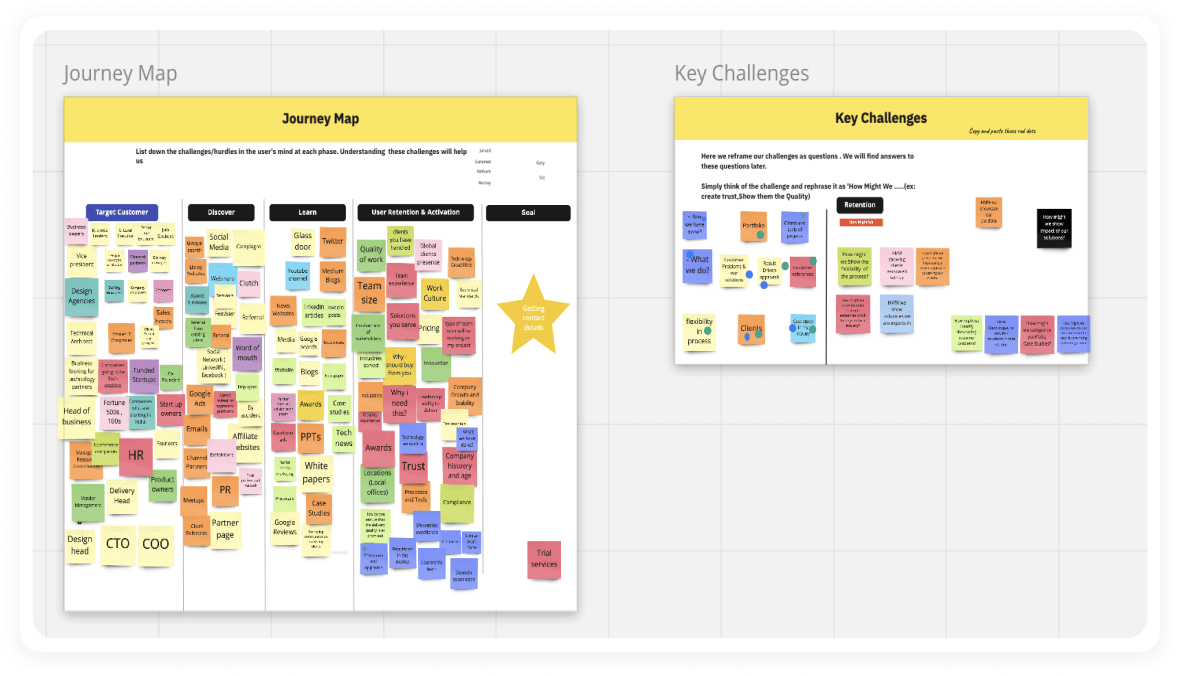
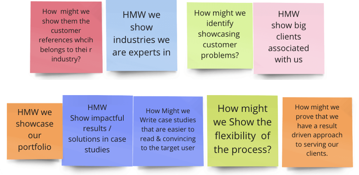
The Top Voted
‘How Might We‘s
that
came
after voting on the painpoints of the site
vistors
“I really loved doing this exercise! We all listed great
points from multiple perspectives in such a short
time. Would love to do more of these at in our own
team”
Sid
Founder & CEO, Successive Tech
Strategies & Conceptualise
Problem Statement 1
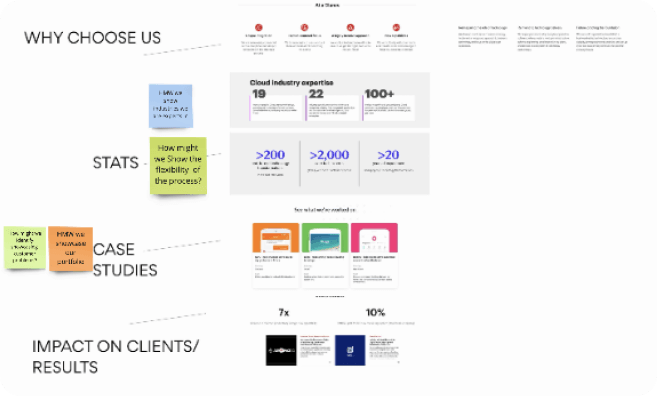
How might we convincingly communicate our expertise & market presence.
Research
To effectively communicate our expertise & trust, we
found that we need to communicate a few of the
below mentioned aspects from our internal research.
- Years of Experience
- Showcase big clients
- Authentic testimonials from our clients
- Total number of projects executed
- Years of expertise
- Results & outcomes of successful projects
- Range of Industries worked with
Ideation
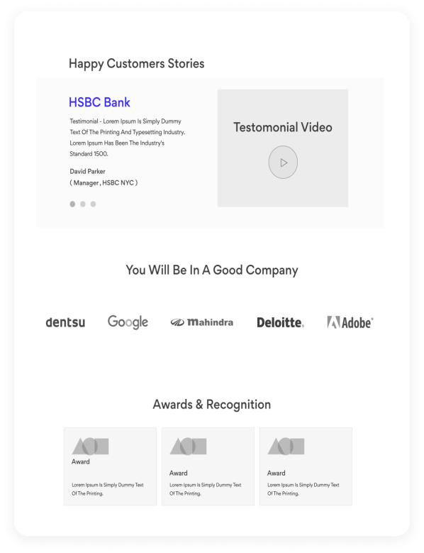
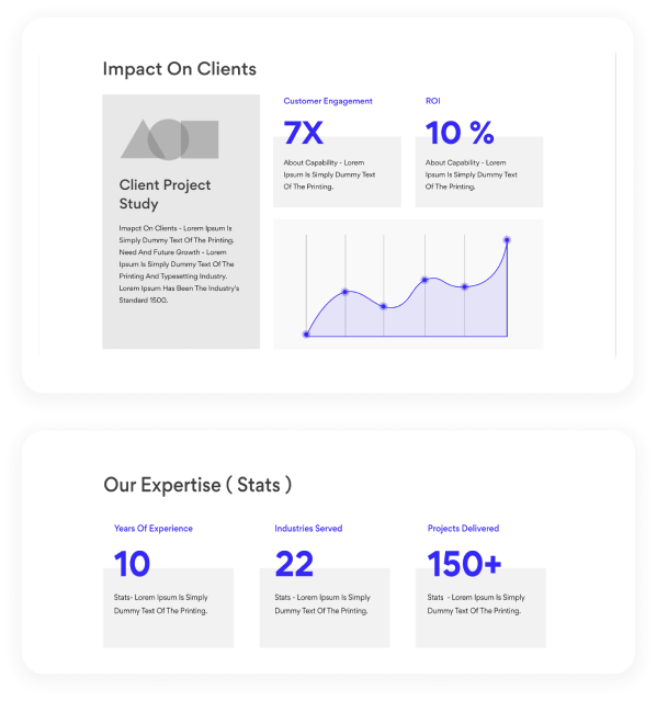
We explored ideas and produced wireframe blocks internally
to come up
with ways for communicating our expertise.
Problem Statement 2
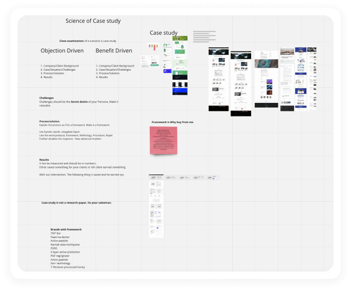
How might we create casestudies that are more effective in getting users to read them.
Research
We discovered that we needed to discuss a few of the
following aspects from our internal research to make
our clients read and communicate our expertise and trust.
- Emphasize on the project Goals & Outcomes
- What was your approach behind the solution?
- Showcase Benefits , not features.
- What was different in our solution
- Don’t add large paragraphs
- Reveal the tools & technology Used
- Use metrics to quantify key results
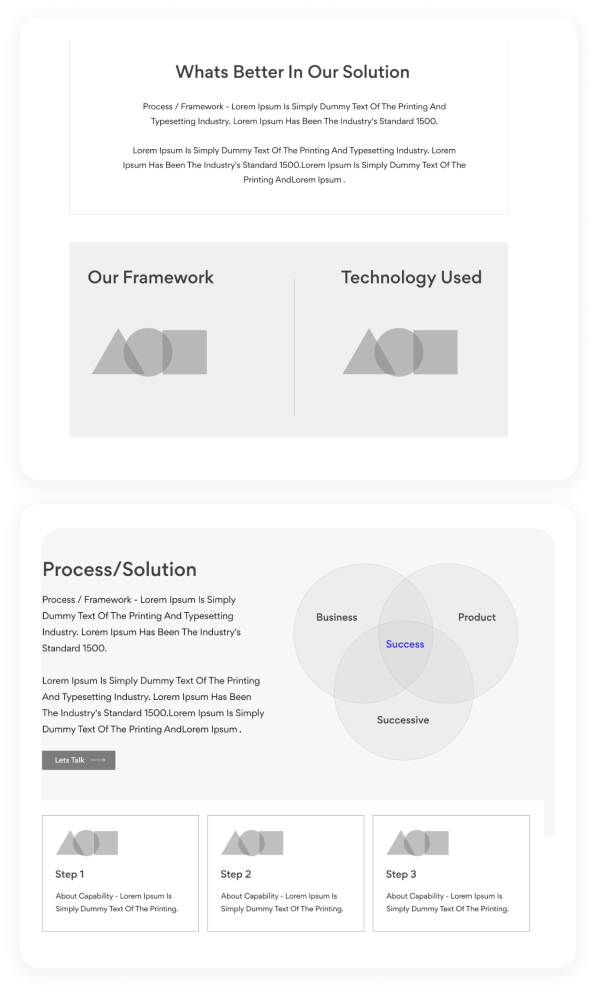
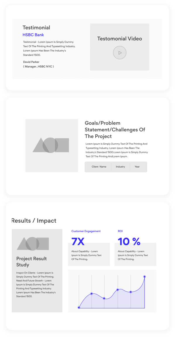
Ideation
We internally brainstormed ideas & created wireframe
blocks to ideate for
solutions around the above mentioned concepts that need to
be
communicated.
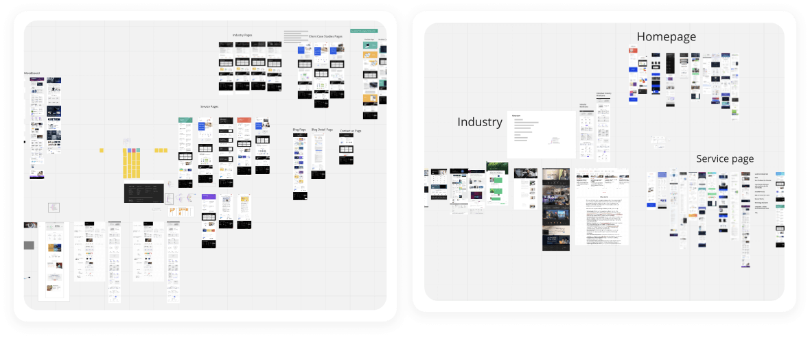
Information Architecture
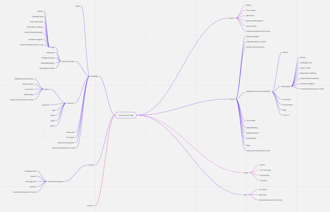
While generating new ideas we also started working out the
layout of the website & its multiple
services & offering. We got together on Miro to work on
creating the below information architecture.
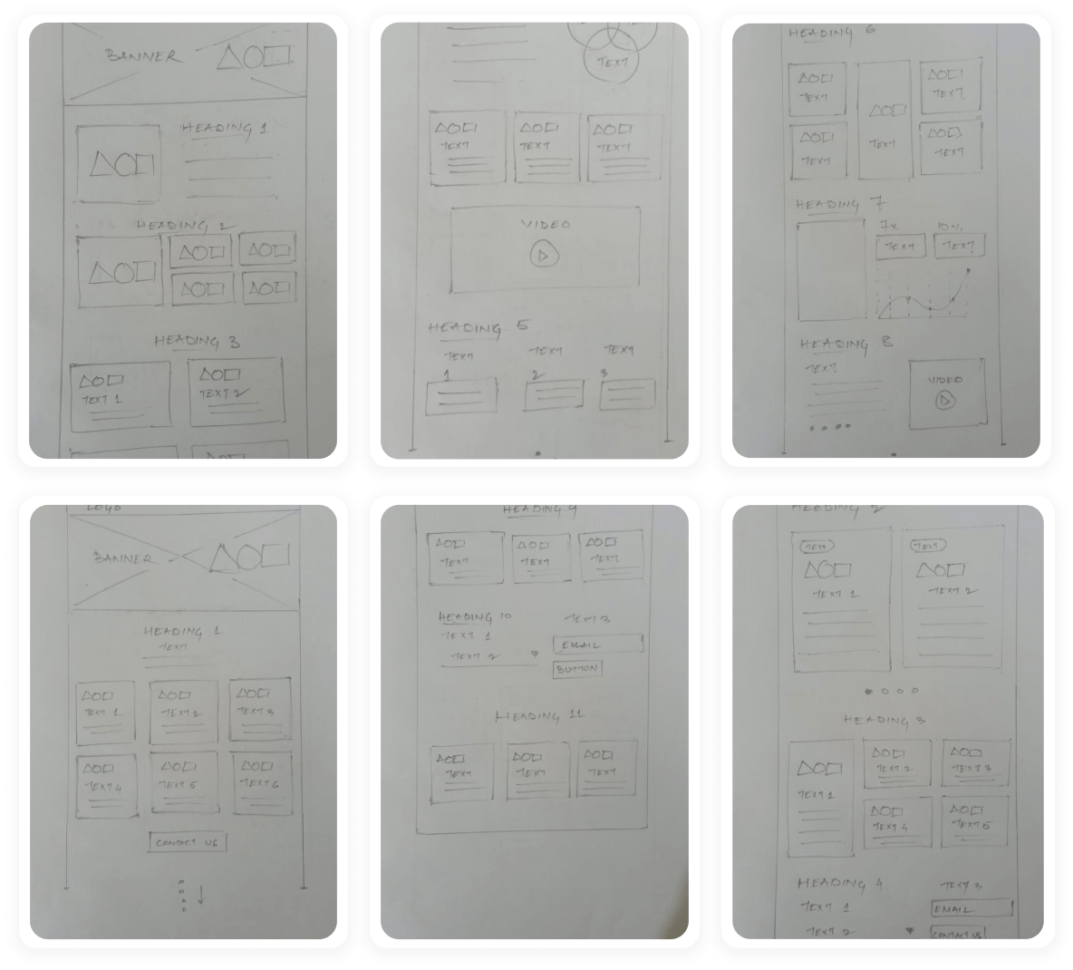
Lo-Fi Wireframing/ Paper Sketches
We started designing the website after organising all of ideas
from the Ideation phase. To begin,
we sketched some of the site's main screens, following the user
flows as a guide. This allowed us to
swiftly test a variety of website layout ideas. We then put it
to the test with three people to see if
these solutions met both user and business needs.
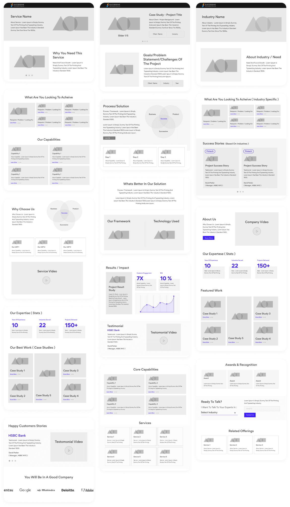
Hi-Fi Wireframing
We started designing my initial wireframes in Figma based on
the feedback and personal insights
we gained during the drawing phase. Throughout the website, we
took sure to prioritise the
features that would best meet the demands of the users.
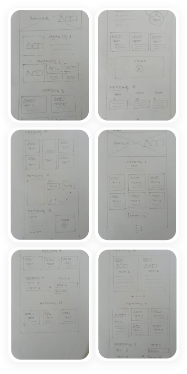
Lo-Fi Wireframing/ Paper Sketches
We started designing the website after organising all of ideas from the Ideation phase. To begin, we sketched some of the site's main screens, following the user flows as a guide. This allowed us to swiftly test a variety of website layout ideas. We then put it to the test with three people to see if these solutions met both user and business needs.
Hi-Fi Wireframing
We started designing my initial wireframes in Figma based on the feedback and personal insights we gained during the drawing phase. Throughout the website, we took sure to prioritise the features that would best meet the demands of the users.

UI Style Guidelines
Primary Colors
Eerie Black
#1F1F1F
Vivid Red
#F30E0E
Secondary Colors
Electric Orange
#F73706
Dark Tangerine
#FCA013
Complimentary Colors
Black
#000000
Quick Silver
#A4A4A4
Bright Gray
#EFEFEF
White
#FFFFFF
Typefaces
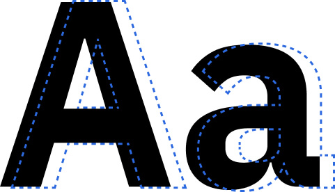
Gordita
Google Font
Medium
Regular
Open Sans
Google Font
Medium
Regular
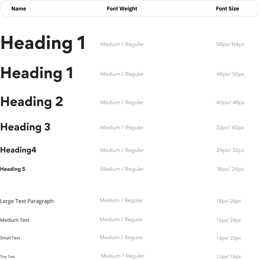
Text Hierarchy
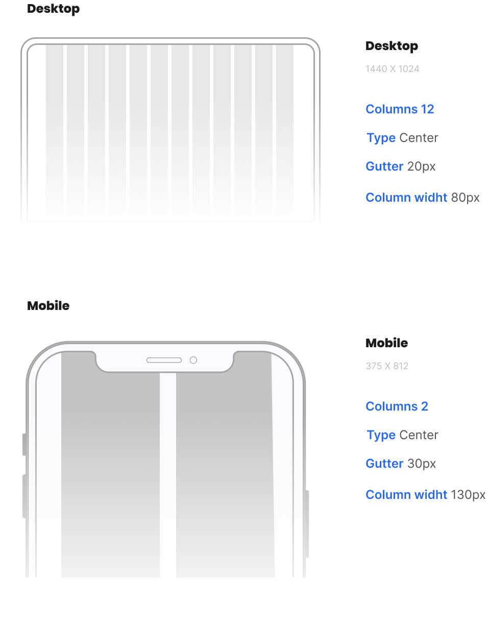
Grid
Hi-Fi UI Design
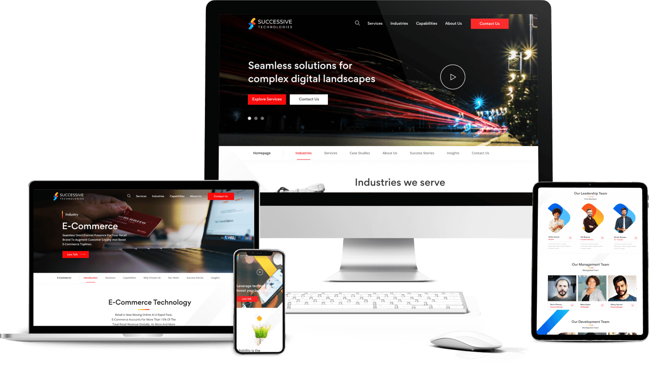
On the basis of all the User research & analysis, We created the
final UI Design
prototype. Below you can find my initial explorations into how
this visual style might
look. It Is a MVP( Minimum Viable Product). I wanted the visual
design to emphasise
these core values: simplicity, creativity, and tradition.
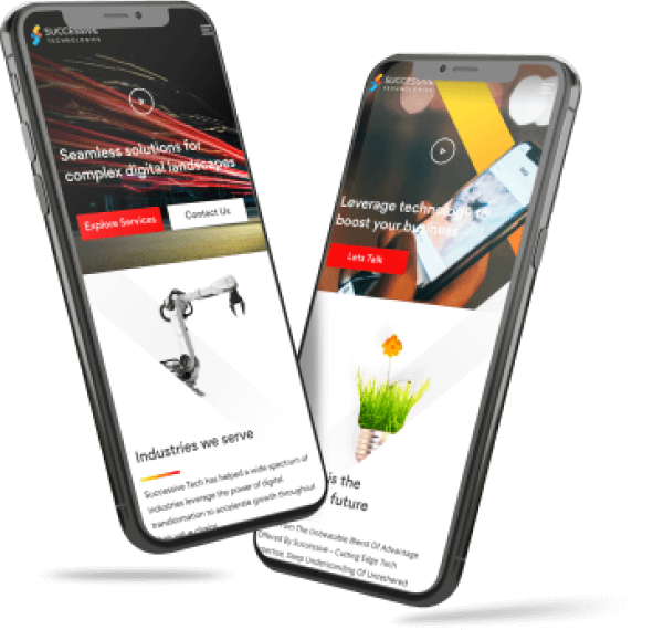
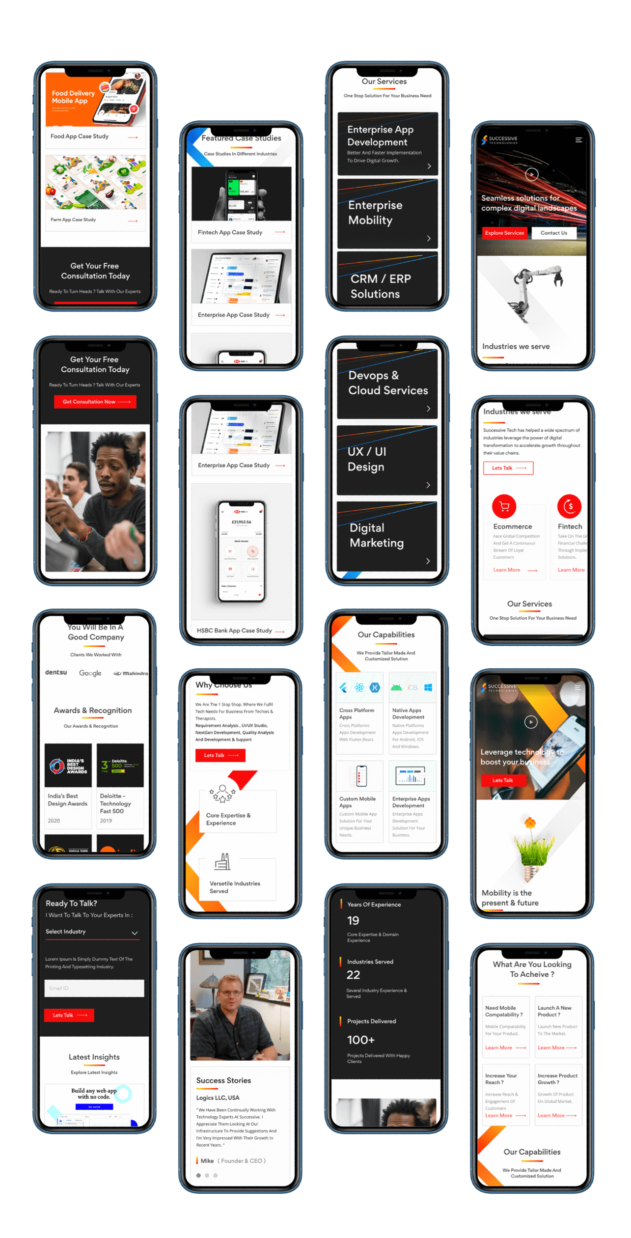
!created a Mobile Responsive versus.
as well to keep in track with the current Design Trends


Mobile Design
In the process, I also created a Bookista Mobile Application. It
is a MVP(minimum Viable
Product). According to statistics, about 60% of traffic comes
from mobile devices.
Impact
Mobile conversion rate increased by
2.4X
Bounce rate reduced to
46%
Average orders up by
124%

Thank you team!
With your conversion strategy in place , we are now able to
close 4 times more customers than
our previous website. We are so happy about it!

