Year
Project Brief
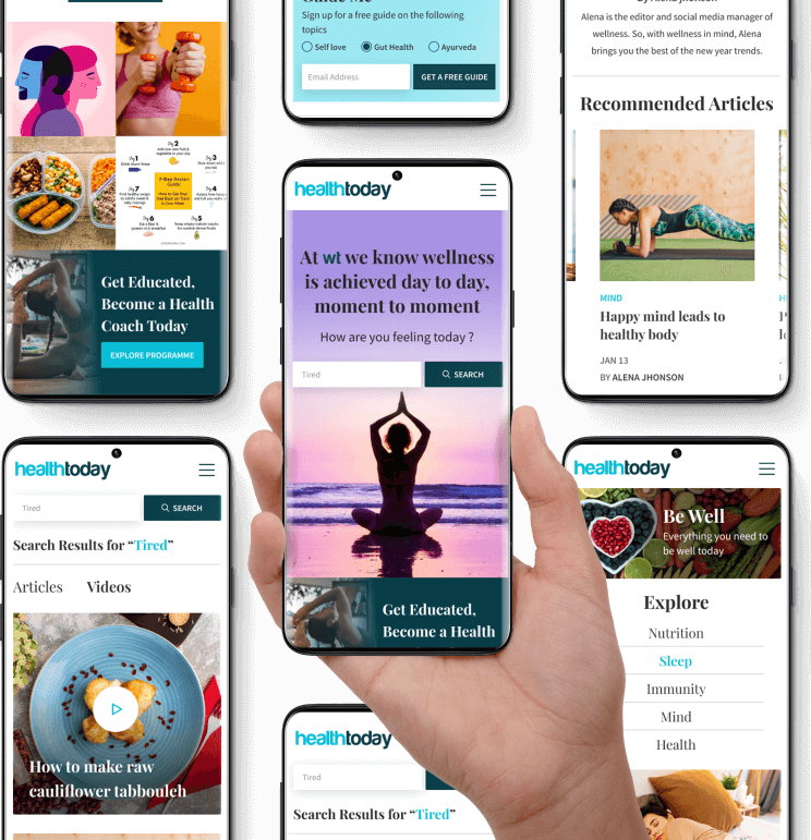
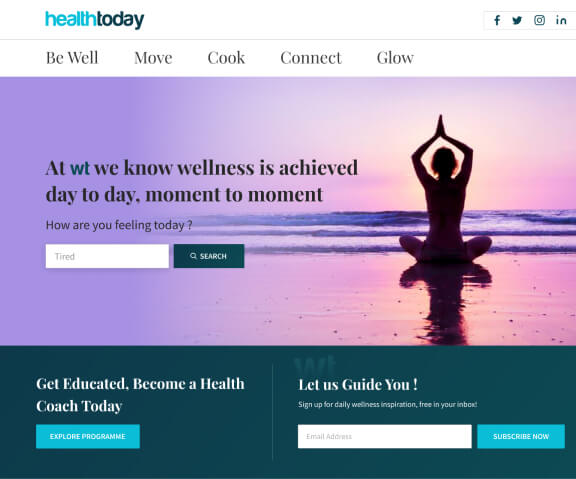
Health Today is an online holistics wellness blog. They wanted to recreate their website to prepare for a global launch to revive their old popular blog brand.
Goals for the website
Health Today is an online holistics wellness blog. They wanted to recreate their website to prepare for a global launch to revive their old popular blog brand.
Migration from old website to new website
Implement videos along with blogs
Introduce subscription module to increase customer base
Incorporate couses and products selling
Project Brief
Health Today is an online holistics wellness blog. They wanted to recreate their website to prepare for a global launch to revive their old popular blog brand.

Goals for the website
Health Today is an online holistics wellness blog. They wanted to recreate their website to prepare for a global launch to revive their old popular blog brand.
Migration from old website to new website
Implement videos along with blogs
Introduce subscription module to increase customer base
Incorporate couses and products selling
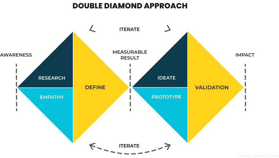
Our Process for the Project Brief
For the project brief of wellness today, we followed the “Double
Diamond” UX Process.
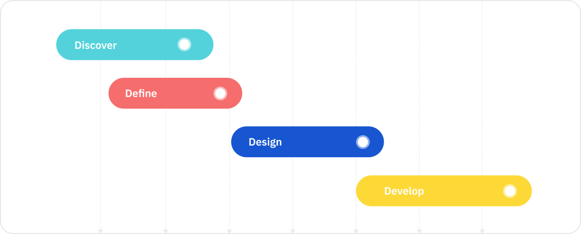
Our Timeline
We were given a 8-week period in which to understand the
problem, explore ideas, create wireframes and designs, and then
begin development.
Technology Used
figma
miro
html
Zeplin
CSS
FlowMapp
After Effects
Discover & Explore
Before delving into possible solutions, we reviewed multiple
other successful competitors in their industry to
be abreast with the rapidly changing technology consulting
industry. We initiated with secondary research
Secondary Research
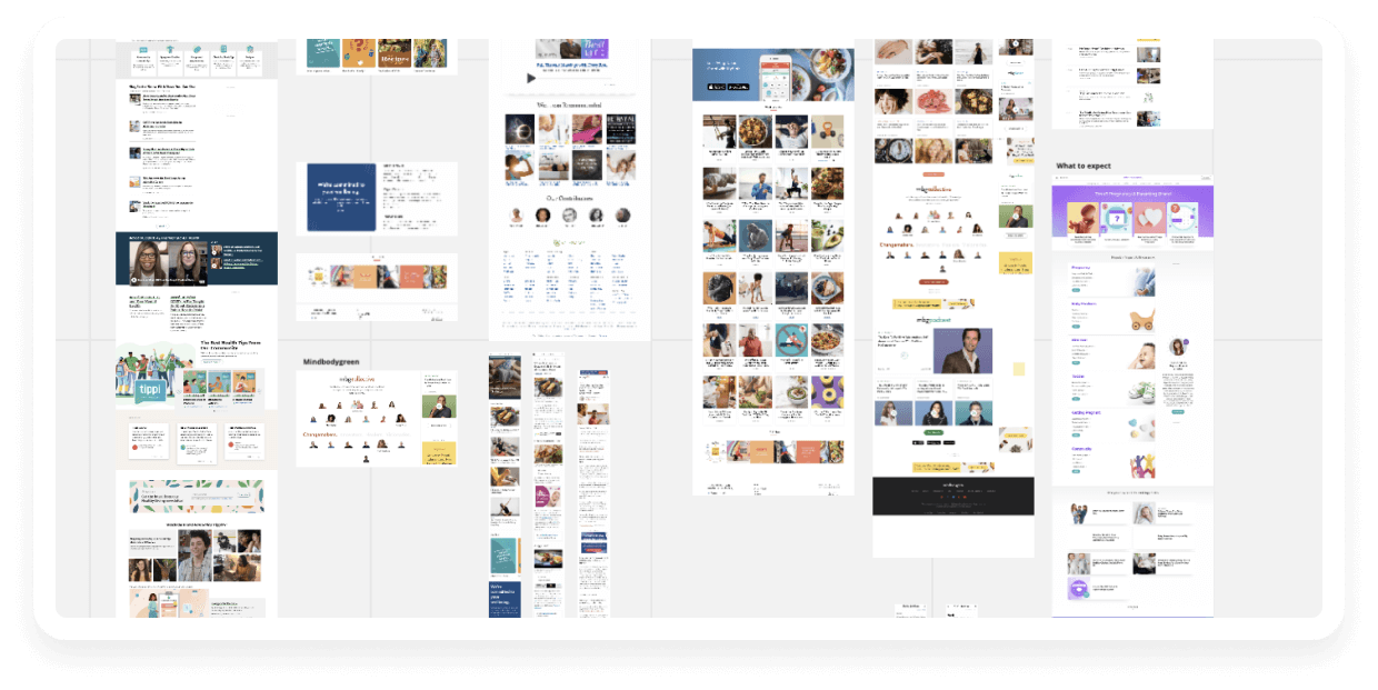
On a whiteboard, we looked at a variety of competitors' designs,
styles, and positioning to get a better
understanding of what they were doing.
Customer Map
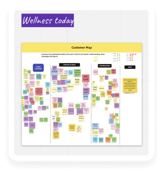
We invited everyone to learn more about our Customer, including
several key members of the HealthToday team.
With the customer map, we wanted to better understand the stages
of the customer experience and have them describe their pain
points while looking for a health firm.
Challenges
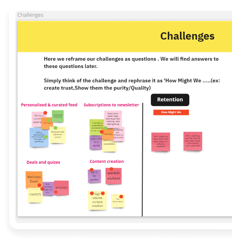
To understand our Target Audience more closely, we invited them
& some key members from the team at Successive. This helped us
have perspective from all sides of the business & the clients.
Our objective with Journey mapping was to understand the stages
of the client experience & asked them to list down their
painpoints when they are looking for a technology consultancy
service company
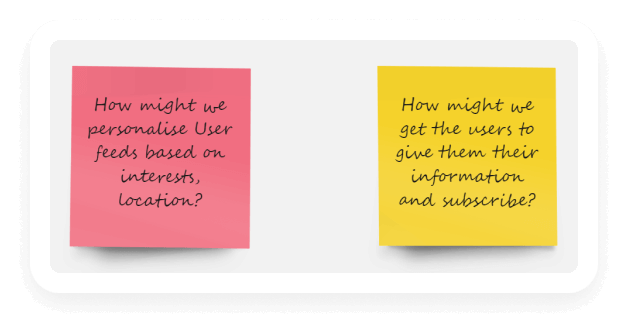
How Might We’s
The Top Voted ‘How Might We‘s that came after voting on the painpoints of the site vistors.
Competitor Analysis
We did competitor analysis by researching major competitors of
wellnesstoday to gain insights into their
product, sales and marketing techniques.

Define
Before delving into possible solutions, we reviewed multiple
other successful competitors in their industry to
be abreast with the rapidly changing technology consulting
industry. We initiated with secondary research
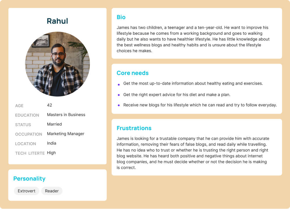
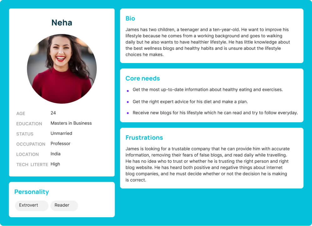
User Persona
User personas are fictionalised versions of our target audience.
User personas were created by researching and
outlining the goals, pain points, behaviour, and demographic
information of our ideal customer.
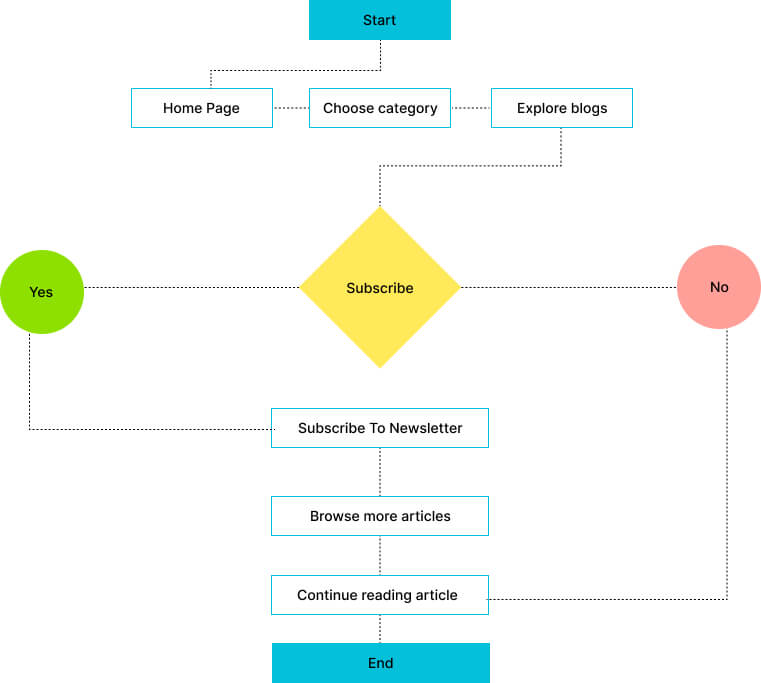
User Flow
The user flow described how a user will complete a task in an application.
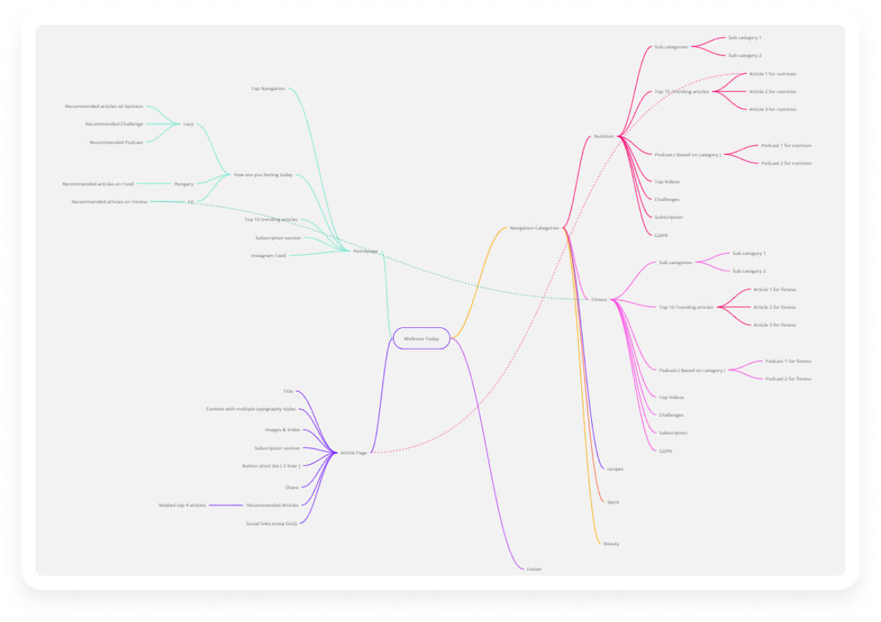
Information Architecture
Before delving into possible solutions, we reviewed multiple
other successful competitors in their industry to be
abreast with the rapidly changing technology consulting
industry. We initiated with secondary research
Strategise & Conceptualise
Before delving into possible solutions, we reviewed multiple
other successful competitors in their industry to
be abreast with the rapidly changing technology consulting
industry. We initiated with secondary research
Problem Statement 1
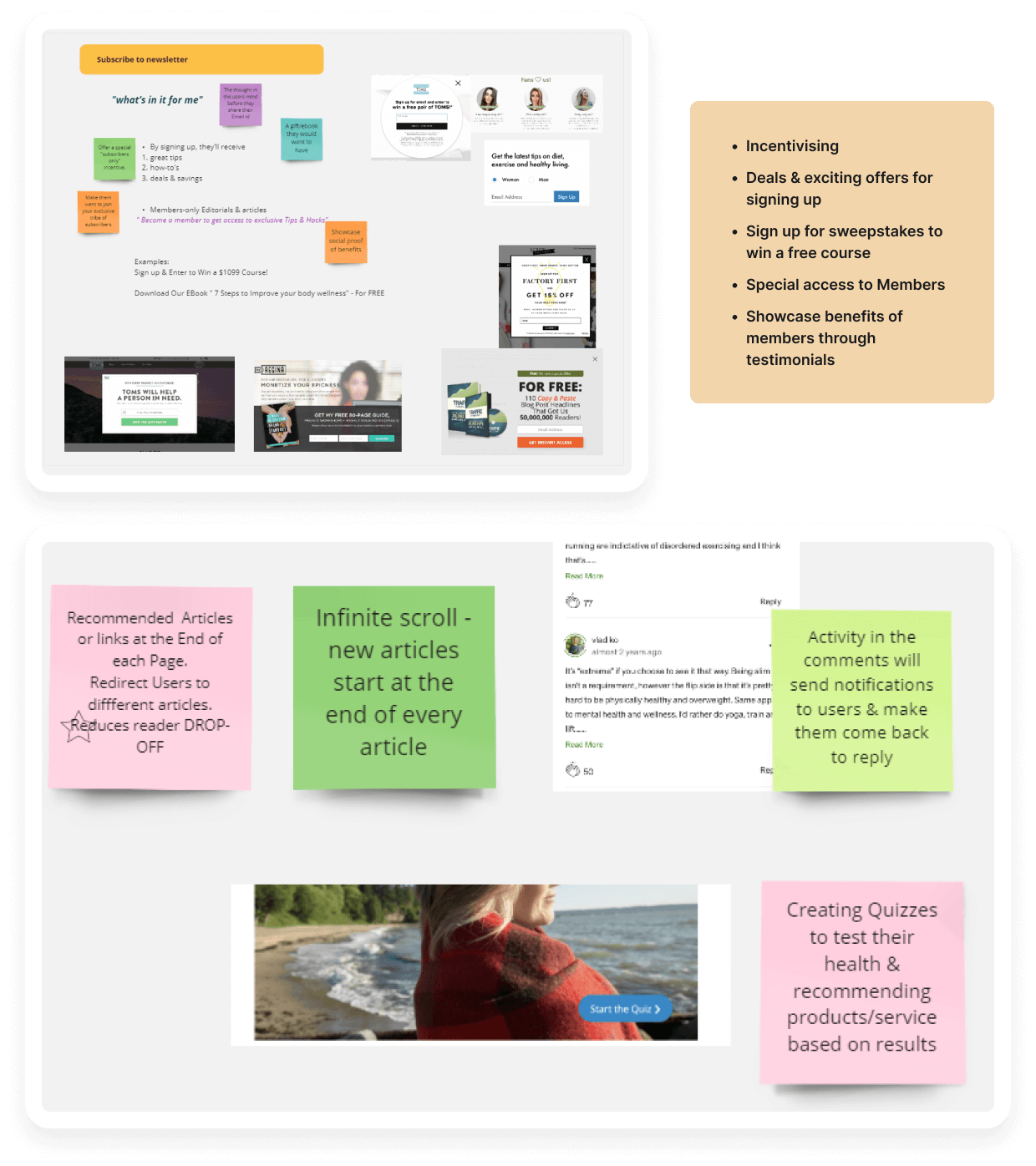
How might we make the visitors subscribe to our blog?
Research
To effectively communicate our expertise & trust, we found
that we need to communicate a few of the below
mentioned aspects from our internal research.
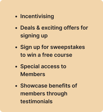
Research
To effectively communicate our expertise & trust, we found
that we need to communicate a few of the below
mentioned aspects from our internal research.
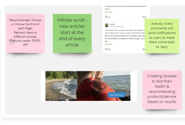
Solutions
We internally brainstormed ideas & created wireframe blocks to ideate for solutions around communicating our expertise. We internally brainstormed ideas & created wireframe blocks to ideate for solutions around communicating our expertise.We internally brainstormed ideas & created wireframe blocks to ideate for solutions around communicating our expertise.
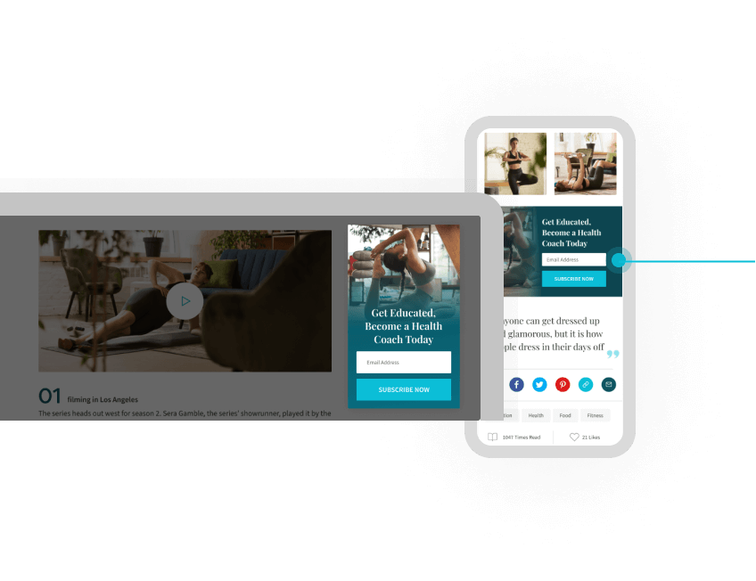
01
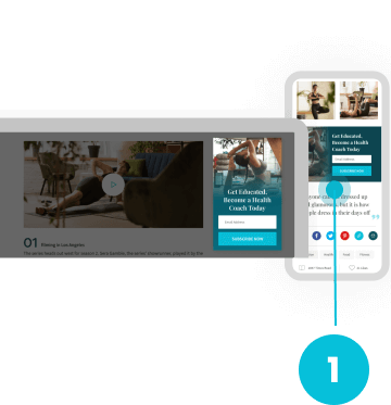
having a sticky subscription box on the right hand side of the page so that the subscription box is always in the focus which can lead to more number of visitors signing up.
having a sticky subscription box on the right hand side of the page so that the subscription box is always in the focus which can lead to more number of visitors signing up.
02
we can get more visitors subscribe to our mailing list by offering them a free guide on one of the topics they might be interested in.
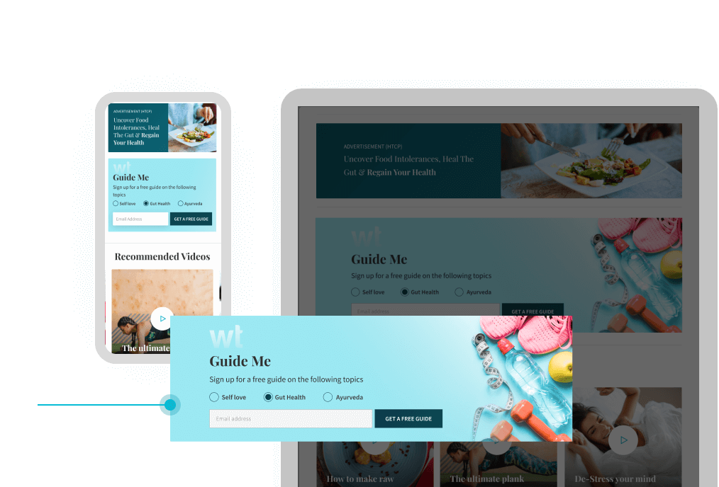
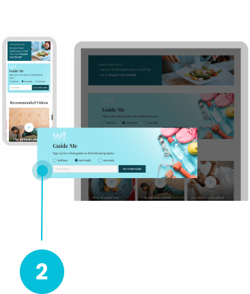
we can get more visitors subscribe to our mailing list by offering them a free guide on one of the topics they might be interested in.
Problem Statement 2
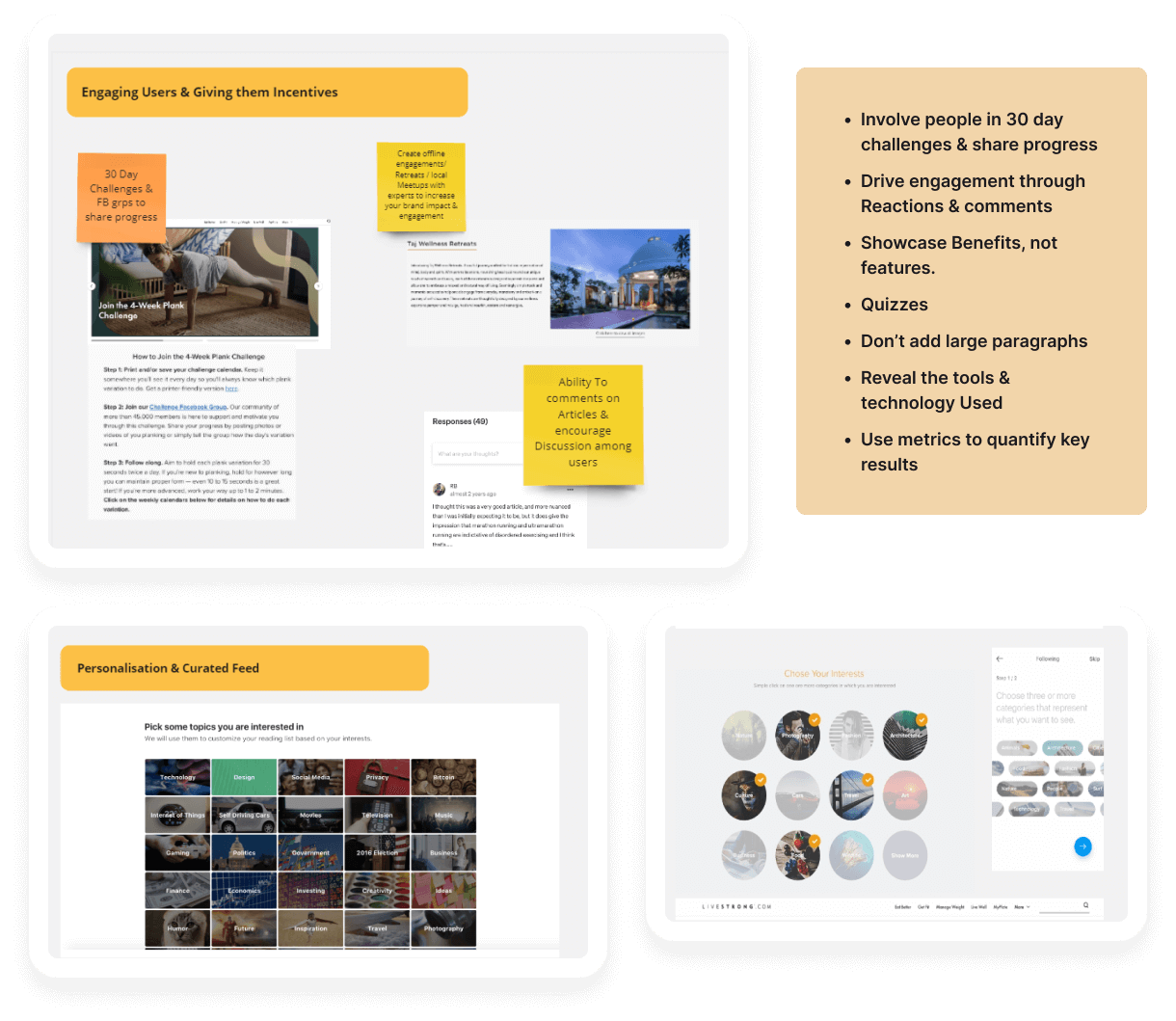
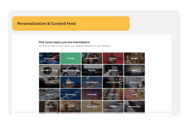
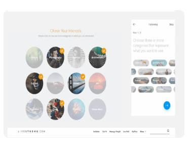
How might we create a personalised experience for our readers?
Research
To effectively communicate our expertise & trust, we found
that we need to communicate a few of the below
mentioned aspects from our internal research.
Solutions
We internally brainstormed ideas & created wireframe blocks to ideate for solutions around communicating our expertise. We internally brainstormed ideas & created wireframe blocks to ideate for solutions around communicating our expertise.We internally brainstormed ideas & created wireframe blocks to ideate for solutions around communicating our expertise.


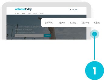
01
showing top categories on the top of homepage, so that people can right away jump into a category and start reading blogs in that topic
showing top categories on the top of homepage, so that people can right away jump into a category and start reading blogs in that topic
02
recommended articles that can be personalized based on the types of blogs users like to read so that they can continue reading the articles of their interests.

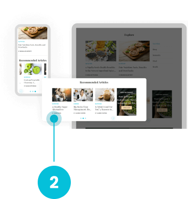
recommended articles that can be personalized based on the types of blogs users like to read so that they can continue reading the articles of their interests.
03
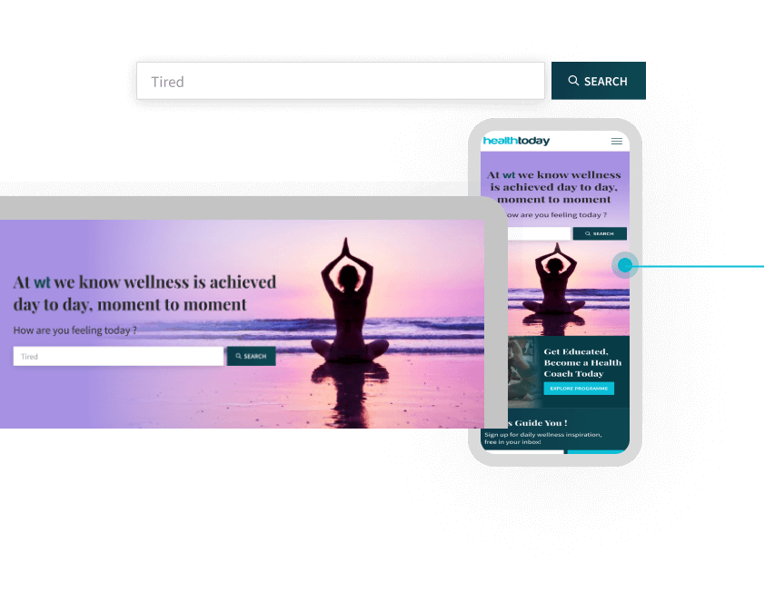
having an open search bar, so that the visitors can immediately type in their interested topic of choice without speniding time choosing from the categories displayed in the previous proposed solution.
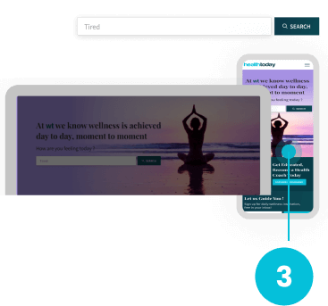
having an open search bar, so that the visitors can immediately type in their interested topic of choice without speniding time choosing from the categories displayed in the previous proposed solution.
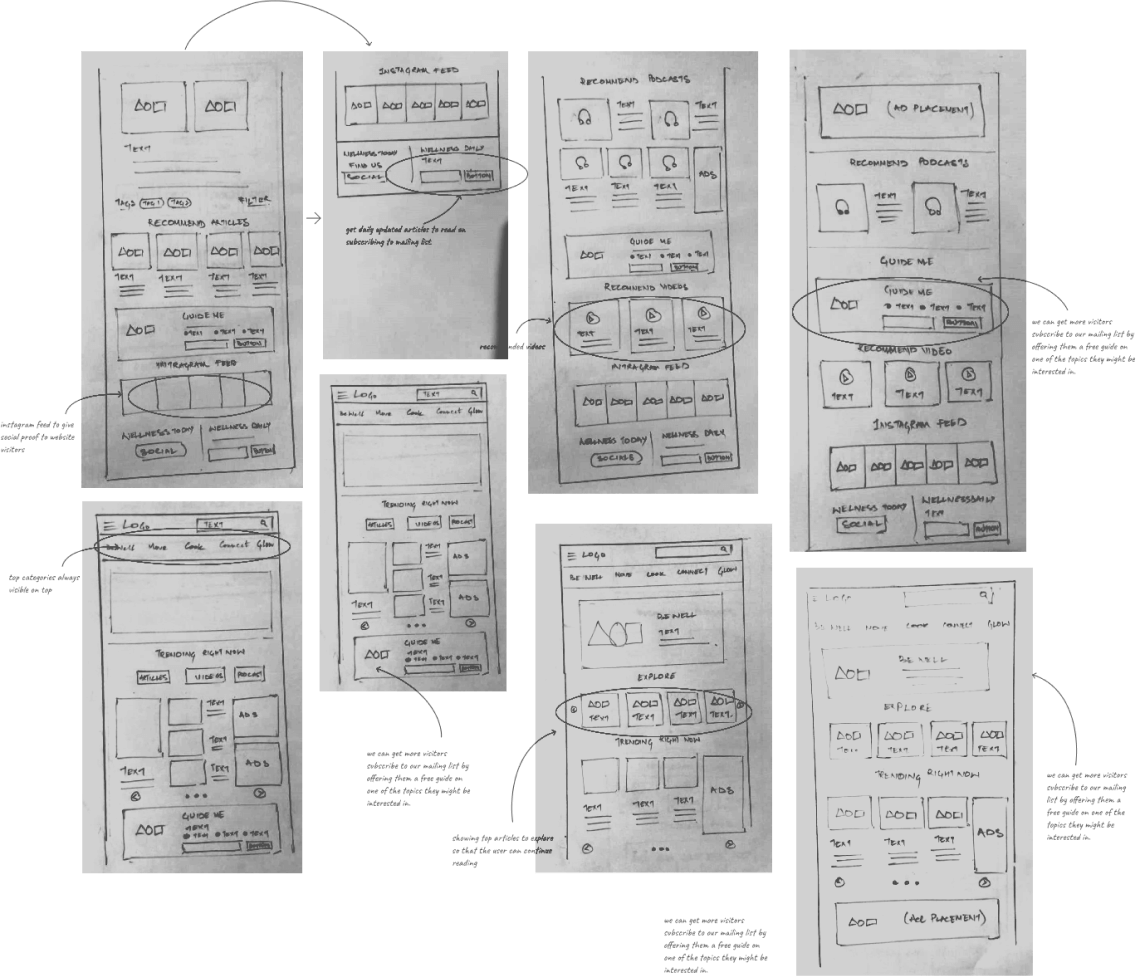
Lo-Fi Wireframing/ Paper Sketches
Once I organised all my insights from the Ideation phase, I
began to design the website. To start this process
I began to sketch several of the site's men screens, using my
user flows as a guide. This allowed me to quickly
explore several concepts for the website layout. I then tested
this with 3 participants to validate whether these
solutions addressed both the user and business needs.
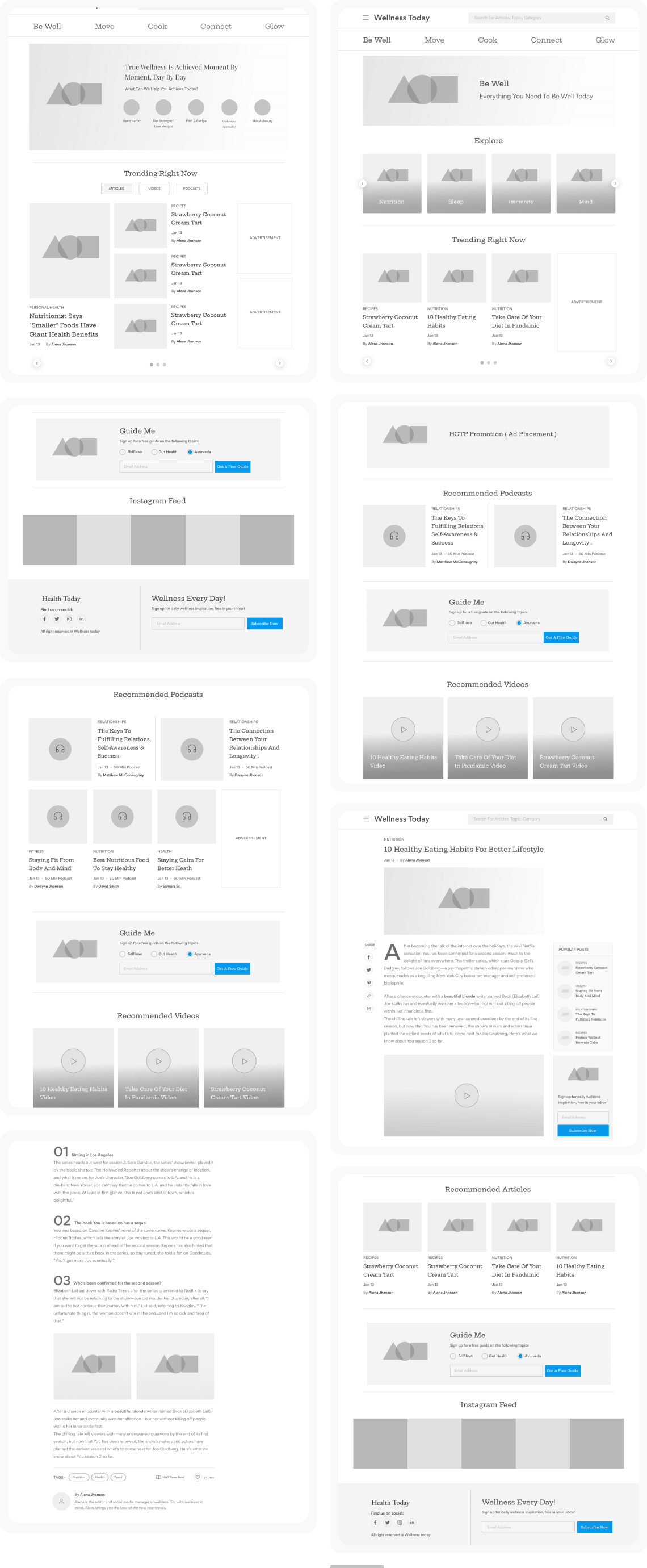
Hi-Fi Wireframing
Based on the feedback and personal insights I learned from the
sketching phase, I began to design my first
wireframes using Figma. I made sure to prioritise the features
that would best address the needs of the users
throughout the website.
Design
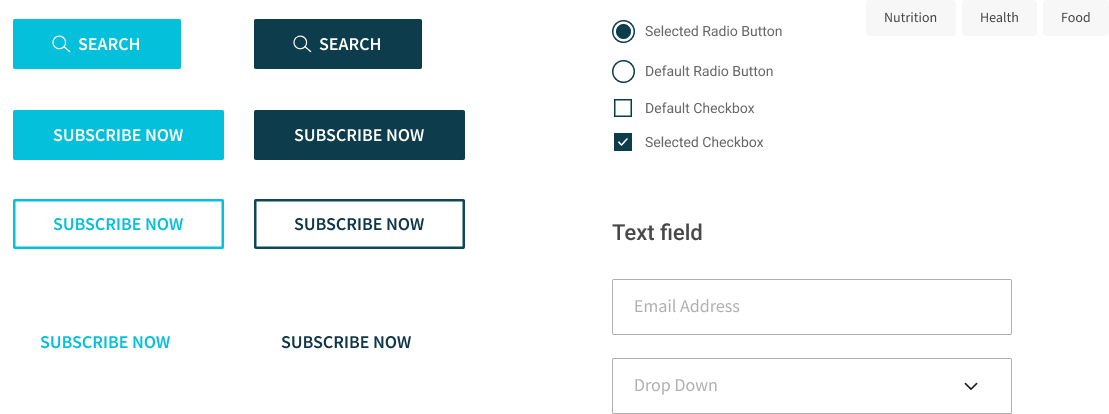
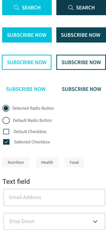
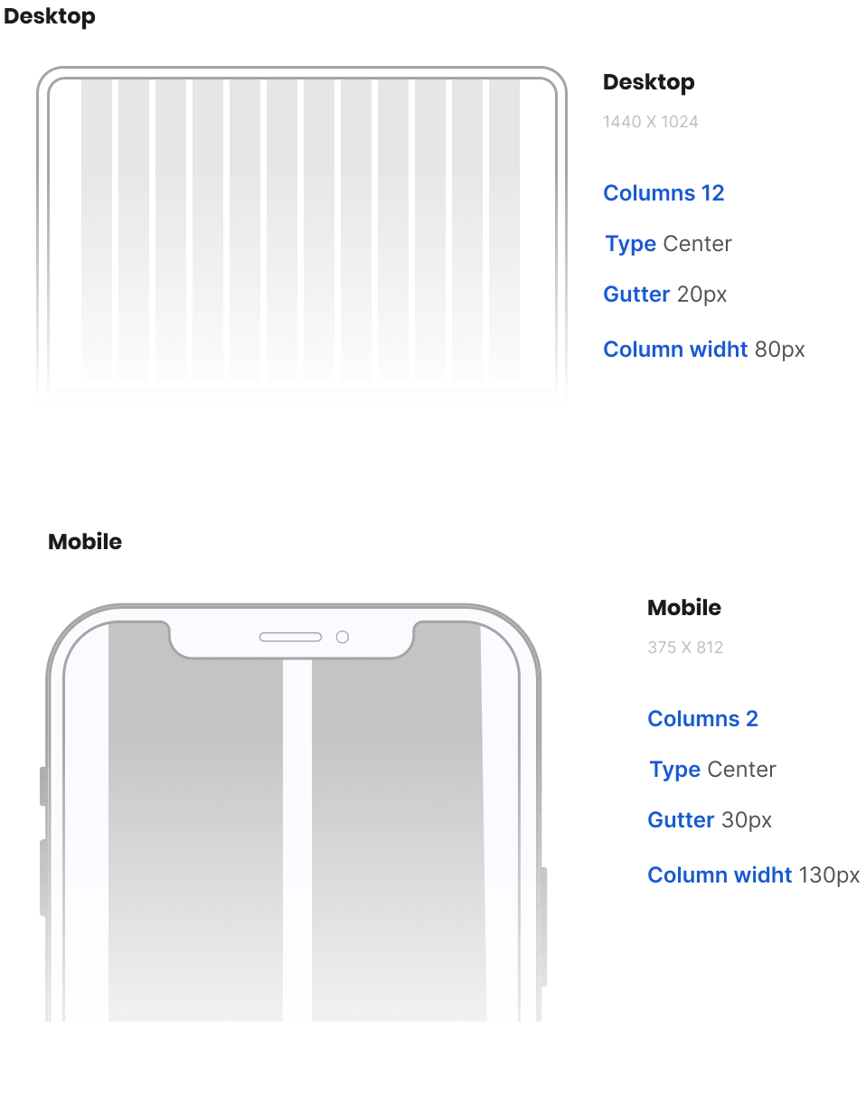
Establishing design system and UI design. Out recipe of process to design a user focused application both on-site and in the cloud.
Design
Establishing design system and UI design. Out recipe of process to design a user focused application both on-site and in the cloud.
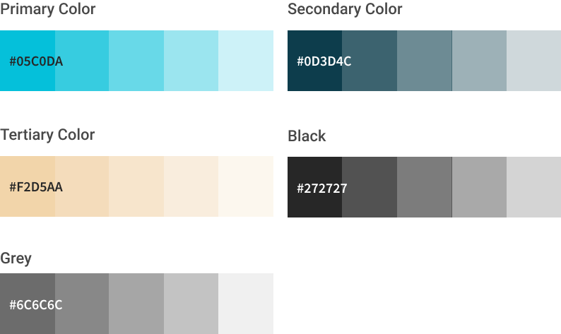
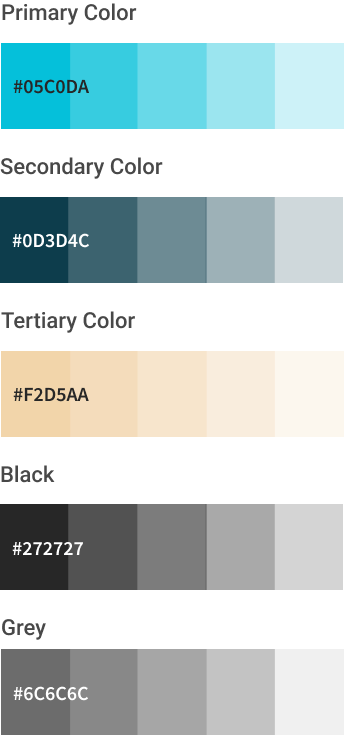
UI Style Guidelines
Colors & Typography
Color
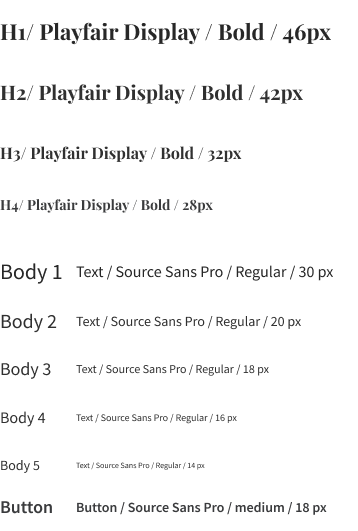
Typography as the craft of endowing human language with a durable visual form.
Typeface
Playfair Display
Playfair is a transitional design. From the time of enlightenment in the late 18th century, the broad nib quills were replaced by pointed steel pens. This influenced typographical letterforms to become increasingly detached from the written ones. Developments in printing technology, ink and paper making, made it possible to print letterforms of high contrast and delicate hairlines.


Components
Components
Grid
Grid

Hi-Fi UI Design
On the basis of all the User research & analysis, I created the
final UI Design prototype. Below you can find my initial
explorations into how this visual style might look. It Is a MVP(
Minimum Viable Product). I wanted the visual design to
emphasise these core values: simplicity, creativity, and
tradition. !created a Mobile Responsive vers s. as well to keep
in
track with the current Design Trends
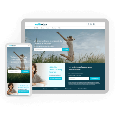
Homepage

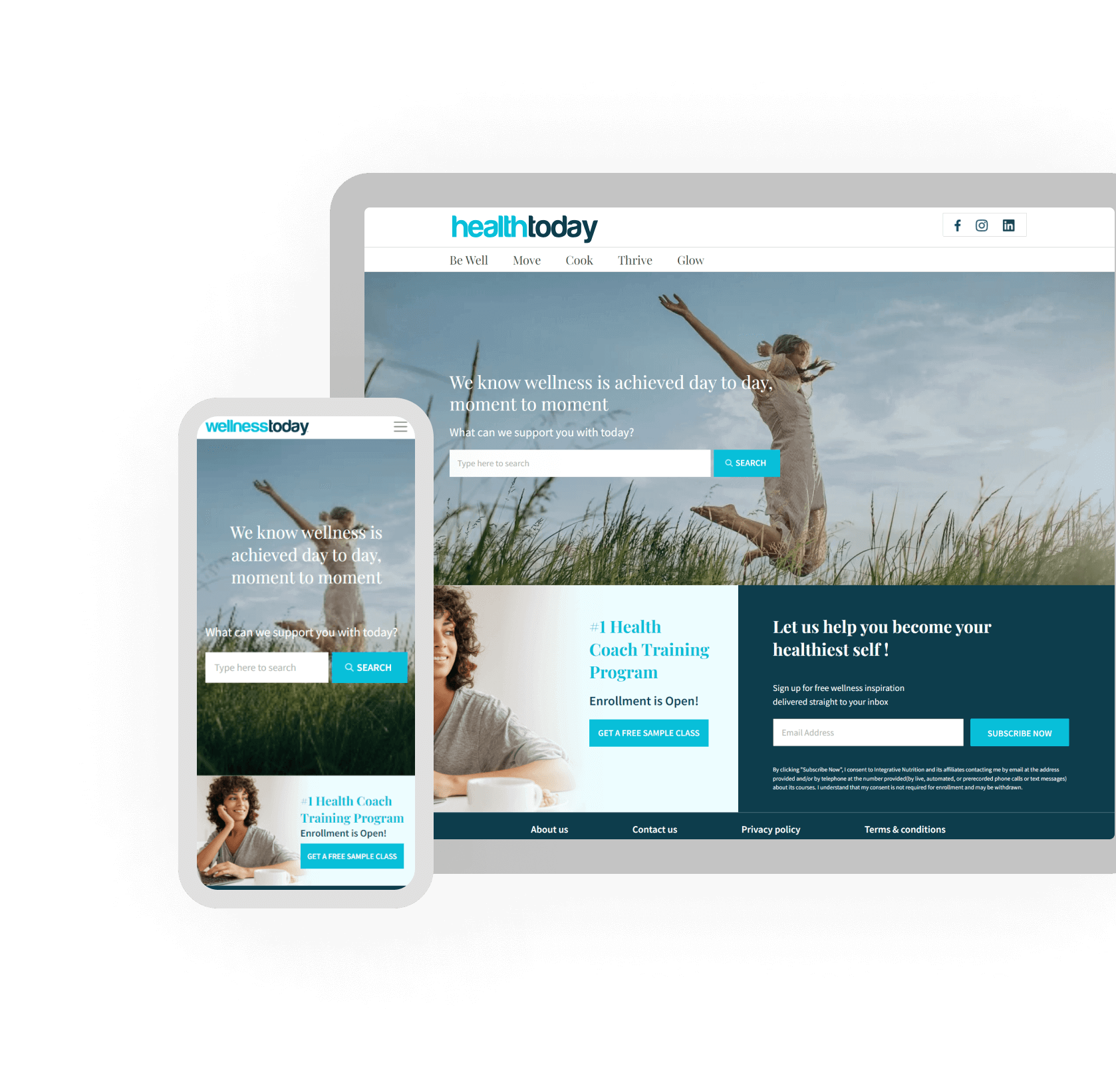
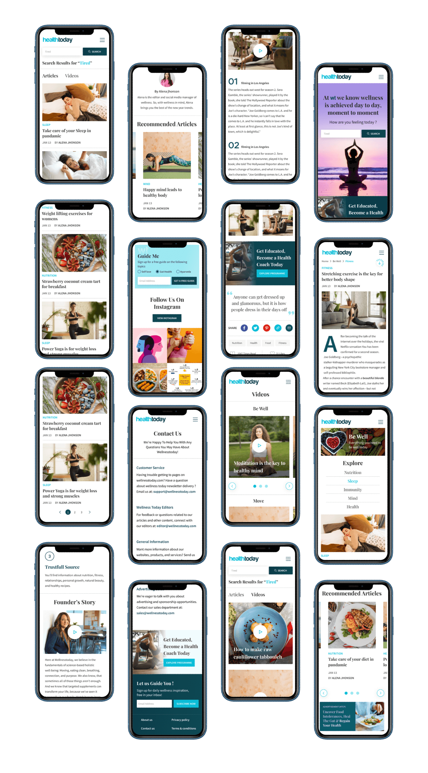
Mobile Design
We also did mobile responsive designs for the website since
almost 90% of the traffic is only from
mobile devices.
Impact
Mobile conversion rate increased by
2.4X
Bounce rate reduced to
46%
Subscrptions increased by
124%

Thank you team!
With your conversion strategy in place , we are now able to
close 4 times more customers than
our previous website. We are so happy about it!

